Sammy's Gourmet Sandwiches
July 2023
Sammy’s Gourmet Sandwiches is a local sandwich shop that aims to sell high-quality sandwiches at an affordable price. They specialize in bulk orders and they help users who are trying to cater to parties. The goal of this website is to make ordering sandwiches online simple and fast for all users.
This is another project of the Google UX Design Certificate and it was meant to teach me about responsive web design. I had to think about how the website will look on other devices by using Adobe XD.
Team:
-
Solo Project
My Role:
-
UX/UI Design
-
UX Research
Tools:
-
Adobe XD
-
Google Workspace
Research
Problem
Browsing or ordering sandwiches online on other websites is inefficient and confusing.
Goal
Design a Sammy’s Gourmet Sandwiches website to be user friendly by providing a checkout process that’s fast and easy to navigate through.
Summary
In my user research, I created empathy maps to understand the potential users for Sammy’s Gourmet Sandwiches. After my research, I discovered that a lot of the users who hope to use the website are people who want an efficient way to order sandwiches in bulk for events and parties. This was the primary user group and they confirmed my assumptions them. One of their main problems was going through the checkout process when bulk ordering sandwiches. Other problems included finding a variety of sandwiches to choose from and finding sandwich shops that could fulfill such orders.
Pain Points
-
Navigation: Users have a hard time navigating through the checkout process and it could be difficult understanding what’s needed to progress.
-
Time: Users don’t always have the time to go through the checkout process and want to order quickly.
-
Accessibility: Users find it frustrating how ordering in bulk can sometimes be a bit too expensive and feel as if they’re being overcharged.
Persona

Brittany is a busy, food-loving intern who needs an efficient way to order sandwiches in bulk because ordering so much food takes a lot of time and she wants her food to be available to pick up.
User Journey Map

Mapping out Brittany’s user journey map showed how efficient it would be to have a responsive website dedicated to ordering sandwiches online.
Low Fidelity Designs
Sitemap

For my sitemap, I decided to use a hierarchical website structure. The user starts off on the homepage and then go to 5 main categories with each of them their own subcategories. I think organizing the website this way is ideal since other restaurants have these main categories.
Paper Wireframes
Desktop Version
These are some paper wireframes for the homepage of my website. I combined all the favorite parts of the previous sketches into the final one.
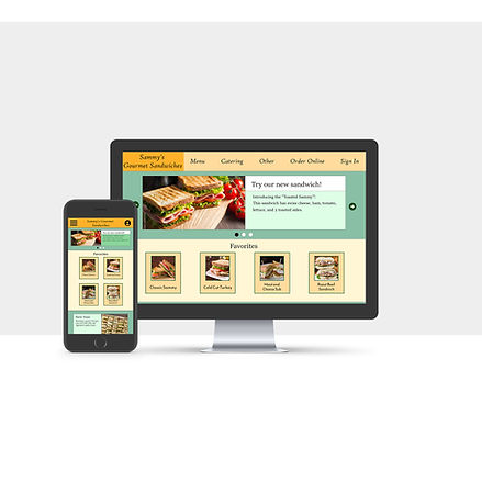
On the final version of my homepage, I wanted to have hero images that show new things about the sandwich shop. The homepage also shows popular sandwiches, catering, hours, locations, and other information.


Mobile Version
This the small size/ mobile variant for the homepage. I had to use less columns for each section in order for everything to fit on a mobile platform. I also used the hamburger menu to represent the navigation bar.

Digital Wireframes


Low-Fidelity Prototype
The low-fidelity prototype connects the wireframes of the primary user flow. The user’s objective is to order an item.

Usability Study
Parameters
-
Study Type: Moderated Usability Study
-
Location: United States | Remote
-
Participants: 5 participants
-
Length: 10 - 15 minutes
Findings
-
Simple Process: All users were able to understand what they needed to do to complete an order thanks to the flow map.
-
Navigation: Some users were confused why the checkout button wasn’t higher on the screen, why the menu categories were there, and what they needed to do with the pickup or delivery buttons.
-
Scrolling: Some users didn’t like how much they had to scroll in order to look at menu items.
High Fidelity Designs
Mockups
I accounted for the feedback in my usability study by adding some changes to the ordering process. I made each menu category have a button to show that they can be clicked on to immediately scroll to its respective section. Since scrolling through the menu can be tedious, I put a “-” on each menu category header. This will make that menu section collapse but it can be reopened once “-” changes to “+”. I also made the cart section more compact.
I also decided to remove the “Pickup” and “Delivery” options because I wanted the sandwich shop to be specifically for pickup. I even took out the last section of the ordering flow map because it felt unnecessary and the ordering process only takes 3 steps.
Desktop Mockups


Mobile Mockups


High-Fidelity Prototype
The desktop and mobile high-fidelity prototypes presented cleaner user flows. I made it easier to navigate through the menu and understand the ordering process.


Reflection
Designing for 2 different devices was an interesting challenge for me because I had to account for the same components fitting on different screens. It helped me understand that consistency is key to help keep a company's branding through different devices. I also learned that simple design changes can have a major impact on the user experience. As I was creating the website, users from my usability study were confused by some parts that made navigation difficult. Seeing them try to go through my website showed me how crucial it is to design a good user experience.